Showing posts with label School. Show all posts

Tuesday, October 23, 2012

Narrative - GIF Project

In my Narrative and Communication Design class we were assigned to create a GIF, about how to do something. The assignment was : "What can you teach someone in 15 frames? We'll be exploring basic motion principles through simple animation where you will teach all of us how to do something. Besides learning about motion we'll hopefully be learning new skills and more about each other." So I decided to do one on how to make a lyric plate. I make these plates with bible verses and lyrics on them. I thought it would be a good easy tutorial. These are the photos I used to create my GIF:


And here is my final GIF :)


Monday, October 22, 2012

Typography - Alphabet

In my Typography class we have been designing a typeface. :) Honestly it kind of sucks.... but its kind of fun? Maybe...

Assignment

With the aid of FontStruct, design a modular typeface inspired by a historical model. Scan
through old type specimens and closely examine them. FontStruct comes with the limitation that it can only build the letterforms with modular blocks. It is not expected, or desired, that your final typeface be an exact replica. They should feature traits of your source material, like weight, contrast, proportions and emotion.
You may choose any genre you like, from the early humanist serifs, to wild west wood type, to geometric sans serifs. The result can be a hybrid of styles, but be careful not to make a frankenstein. Always remember that type is meant to be read. Complex designs bring more opportunities for distraction. Try to pull from older sources, rather than only contemporary designers.

Process Outline

  • Moodboards (2 options)
Fill at least one 8.5" × 11" page with images of inspirational typeface specimens (at least 5).
Also list five keywords that describe the direction (e.g. chunky, airy, soft, hyper, quiet...).

  • Sketches (3 options)

Study your inspiration, and sketch, sketch, sketch the possibilities! Bring all variations, but
present your three strongest ideas. Each should be on a separate 8.5" × 11" page, showing your
base glyphs(nobae), as well as one whole word. Pen or pencil only.

  • Rough Alphabet
Black and white printouts of all glyphs. The x-height should be between 6-15 units high.

  • Final Speciman 
Present your work on a poster. All glyphs must appear somewhere on the poster. Look back to
the specimens for examples and inspiration.


Here are my 2 Moodboards:


Here are my 3 sketches of my directions I could have gone off of:


 My printout of my rough alphabet:


Here's also the letter I had the most trouble with:


And lastly my process of my final layout of the alphabet and examples of words and sentences:


Thursday, October 11, 2012

B&W Photography - RC Contact Sheets

SO, in the last post about my photography class, I went over the process of developing the film. Now, we move on and do more things with it. But before that, I had to make contact sheets of the film, which we did that Thursday (the 4th) . This entails cutting it into 5 frame long strips and putting it in a sleeve made for just that.
Once we did that we were all set to make RC Contact Sheets. For that we use Ilford RC pearl paper. It is light sensitive, you can't expose it to any white light unless you're making a pring, only red or amber. In the darkroom at PSU we have an amber safe-light in the main area, and 2 red lights in the smaller rooms for developing film.
When using the enlarger to make RC Contact Sheets, all you have to do is adjust the height, and fine focus. You only need the white light to make the negatives positive.
 1. First have your Contact sheet ready, and place it below the enlarger and frame it in the light projecting down from the enlarger.
2. Fine focus so the light surrounding the sheet is a hard line, not fuzzy.
 3.Turn the light off, and have the timer set at 5 seconds. Then your paper out, and place it under the contact sheet. The shiny side of the RC  Paper is the emulsion side, this should be up. Also, the film should be placed so that the emulsion side is also down, both emulsion should be facing each other. We also place a piece of plexiglass or glass over the 2 sheets to press the film down (it curls).
4. We do a test sheet to find the exposure time that is best. The lens is at a 5.6 or 8 fstop. To do the test sheet we cover all but one strip on the contact sheet, expose it for 5 seconds and move to the next. this will give us a sheet to compare exposures with. The sprokets of the film should be barely visable on the RC Paper when its developed. But I'm getting ahead of myself.
5. Now we have to develop the RC Paper. In the dark room there is a large (long) sink that holds 4 tubs. The first one is Developer (that is already mixed for us), the second is Acid Stop Bath, the third is the Fix, and fourth is the wash (running cool water). These all have about a half inch of each liquid.
6. For the RC paper you place the exposed sheet in the Developer tub, and agitate for  2 minutes. We do this by lifting the corners so the developer flows over the sheet constantly.
7. When the 2 minutes are up, you take wood tongs with rubber ends and lift the sheet out and let it drip. and place it in the Acid Stop Bath for 30 seconds.
8. Again, lift the sheet out with a separate pair of tongs, let it drip and place it in the Fix tub for 3 minutes, and agitate. At this point, if you were alone you could turn on a white light and look at it, but since we do this with lots of people we have to go out of the room to see which exposure is right.
9. After the 3 minutes, lift with yet another pair of tongs and place in the wash for 15 minutes. When it's done being washed (with test ones we just rinse them for 30 seconds) you can go out into white light and pick the exposure that is best.
10. When you have picked which exposure is right. ( increments of 5 seconds, 5, 10, 15....) The one that you can barely see the sprocket holes of the film on. Then you make a final one with the exposure you picked, following the same steps again :)

This is what my Final Contact Sheet looks like :) (sorry if it's blurry I took the picture with my phone)


Typography - Design Exercise

In class yesterday (the 10th) we did an in-class exercise. It was very challenging but very fun :) There were a lot of restrictions; we had to design 4 pages of the same information:
(Title)
Thinking With Type
(Author)
Ellen Lupton
(header)
A critical guide for designers, writers, editors, & students
(publisher)
Princeton Architectural Press, New York
(what's new in this edition)
Second revised and expanded edition
More principles, examples, exercises, type crimes, fonts, factoids and fun
(another odd bit)
A design handbook

The restrictions changed for each page:

Page 1
All the same size text, font, weight. No all caps, color changes, underlines or boxes.
Page 2
Same restrictions as page one, but you may use two fonts, weight changes and all caps.
Page 3
Same restrictions as page two, but you may now change sizes.
Page 4
Anything goes!

Here is what I came up with for each :) I hope you like them!

Pages 1 and 2

Pages 3 and 4


Wednesday, October 10, 2012

B&W Photography - Darkroom!

Earlier this week, more specifically Tuesday (the 2nd), I had my first darkroom experience. We had to have taken 2 rolls of pictures over the weekend, and have the film in hand in class on Tuesday morning. During class we developed one of the roll of negatives! The process was pretty tedious, and I was glad I found a partner to do it with the first time, or else.....it probably would have gotten messed up!
SO...this is what we had to do (for people that don't know the process behind it)....
  1.  First we prepared the chemistry...1:9 of 2 oz of developer and 18 oz of 68* water and combine them. Also we prepared 20ish oz of 68* water.
  2. Then we collected the supplies we would need:
  • bottle opener
  • sissors
  • roll of film
  • plastic (or metal) canister
  • A stem for the canister
  • Plastic reel
  • Funnel (light safe) lid for the canister
  • flexible lid for the canister
    3. We had to set all the supplies out, so that we knew where they were and put the stem into the canister.
    4. Turn out the lights (no light anywhere)
    5. Open the film canister with the bottle opener (fromt he flat side, and push the knob up to get the film out), and cut the L shape off the roll of film with the sissors.
    6. Feed the film onto the reel and twist sides of the reel to wind the film in it.
    7. Once its fed all the way through, cut/tear the tape off the end, and stick the reel onto the stem in the canister, we had partners so there were 2 reels of film in it.
    8. Put the funnel lid on the canister, and twist it on till it locks. And put the flexible lid on.
    9. Now the lights can go back on.
  10. We then took off the lid and poured the developer and water in the canister and agitated (turn the canister over, and back) for the first 30 seconds. Then repeat the agitation every min for 10 seconds for 10 minutes.
  11. Then comes the Water Stop Bath. We had to fill and dump the canister 3-4 times with cool water.
  12. After that, we fixed the film. This takes 5 minutes doing the same agitation for 10 seconds every minute for 5 minutes.
  13. After the film is fixed you pour the fix back in the jug, because it contains silver, and that cannot be put down the drain.
  14. After pouring it back into the jug, you wash the film again, but this time, fill and dump 10 times with cool water.
  15.When it is thoroughly washed, we removed the fix, with fix remover/ permawash. This we agitated for 2 minutes straight.
  16. After the 2 minutes of agitation, we set in a bin with cool running water for 10 minutes.
  17. Once it was washed for 10 minutes in the running water, we had to put it in this stuff called photoflo for 30 seconds. It keeps the film from fogging up.
  18. THEN, after taking the film off the reel, our dark room has a film dryer, and you leave it in there for 20 min or until its dry. You can tell if its dry by the film curling towards the emulsion side.

And there you go! The next step is contact sheets and printing. but that'll be another post :)
 

Friday, October 5, 2012

Narrative & Communication Design - Project 1 - Moodboard

This fall I am taking Art 224.... aka Narrative & Communication Design. For our first project we are supposed to create a moodboard about ourselves. I choose to focus on the Photography side of me. While doing this project I went through all my photographs I've taken, and was able to kind of pin point when I started. I think it all started back in 2008 when my family went to Disney World. BUT.... more on that later, back to the moodboard! Starting on this project I changed directions many times....and here is my process!!


I started out with the idea to use my pictures to describe me, and what I like to do. I also thought maybe I should label them! As shown in picture below.....


Then, since i wasn't able to fit every picture I wanted to on there with the labels, I decided to take the labels and borders off.....


That worked a lot better, I think looked more like a moodboard, and was not so cluttered. But, if you noticed, there were lots of awkward shapes that weren't filled. That posed a problem, because it looked incomplete. So, I came up with the idea of filling those shapes in with squares and rectangles of color. I matched the color to my logo for my photography that I included in my moodboard.


When we did critiques in class though, my teacher suggested that I take color samples from the pictures on the moodboard instead. I tried it, and to my surprise it worked a lot better, and looked warmer, and not so uniform.


I noticed that the purple square on the top left was on the same side as the purple rectangle on the bottom left. I wasn't too thrilled with how it looked, so I switched the colors of the top middle rectangle with the purple square on the top left. That worked a lot better in my opinion.
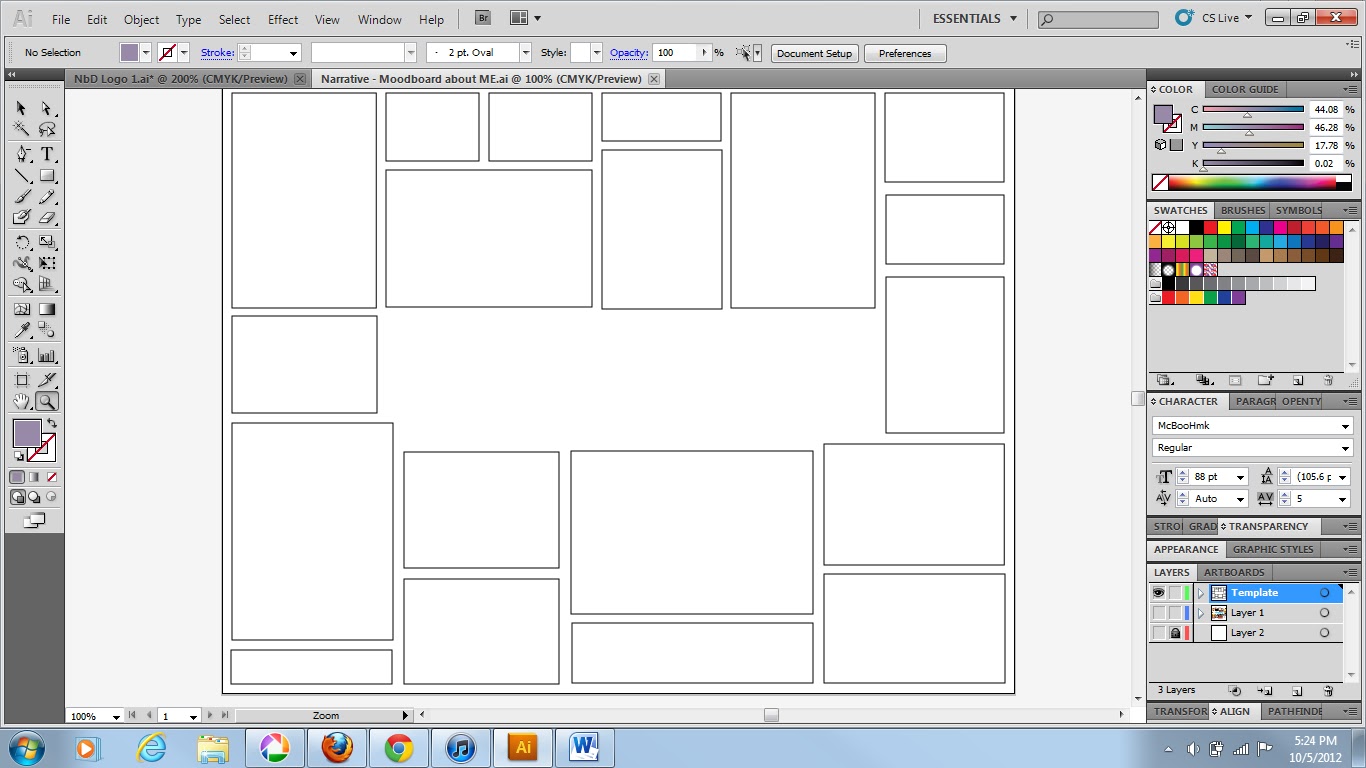
Now, since my teacher had suggested I include photographs that I like, and not just my photography, I created a template from the above moodboard. That way, I can make 2, one of inspiration and one of my photography. I did like the idea of representing me and who I am through my work, but he wants something a little different, so... I'll just make 2!)  


Tuesday, June 5, 2012

Type Poster

In my Art 120 class we were given an assignment to design a poster using type. We had to chose song lyrics or poetic verse of 8-10 words to use as the content and inspiration for a typographic poster. I went through a lot of variations before I came to the final product. You can see my process work here. Below is my final version I turned in.


Tuesday, May 15, 2012

Busyness!

Wow, again I have not had time to really research anything this week. A lot of things have been due, and I have been working on projects non-stop. BUT  the good news is I AM FINISHED! I finished the Caution tape alphabet, finally! Here it is :)
Final 2D Poster of the whole alphabet done in Illustrator.

I realized that I forgot to lay out the ACTUAL caution tape spelling caution...... IMPROVISE! Lol I had to add it in so the shadows aren't right, but oh well.

Caution spelled out in caution tape :)

Wednesday, May 2, 2012

Caution Tape Alphabet

I have not had enough time to even think of researching a topic to post about, so here's whats been taking up all my time :)

I have been working on a project for school, more specifically my Intro to Communication and Design class. In this project we had to make words out of 3D objects like these: 


I went with my Caution Tape idea:


 Then once we chose the idea we liked best we had to start making a 2D version in Photoshop and or Illustrator. Which I have almost gotten half way though!


 This project has been taking up my time... THOUGH I did research Stefan Sagmeister :) So here's some information I had found for the project I did:

 Born in Bregenz, a quiet town in the Austrian Alps, in 1962, Sagmeister studied engineering after high school, but switched to graphic design after working on illustrations and lay-outs for Alphorn, a left-wing magazine.
At 19, Sagmeister moved to Vienna hoping to study graphics at the city’s prestigious University of Applied Arts. After his first application was rejected he enrolled in a private art school and was accepted on his second attempt. Through his sister’s boyfriend, the rock musician, Alexander Goebel, Sagmeister was introduced to the Schauspielhaus theatre group and designed posters for them as part of the Gruppe Gut collective. Many of the posters parodied traditionally twee theatrical imagery and offset it with roughly printed text in the grungey typefaces of punk albums and 1970s anarchist graphics.
In 1987, Sagmeister won a Fulbright scholarship to study at the Pratt Institute in Brooklyn, New York. Here humour emerged as the dominant theme in his work. When a girlfriend asked him to design business cards which would cost no more than $1 each, Sagmeister printed them on dollar bills.
After three years in the US, Sagmeister returned to Austria for compulsory military service. As a conscientious objector, he was allowed to do community work in a refugee centre outside Vienna. He stayed in Austria working as a graphic designer before moving to Hong Kong in 1991 to join the advertising agency, Leo Burnett. When the agency was invited to design a poster for the 1992 4As advertising awards ceremony, Sagmeister depicted a traditional Cantonese image featuring four bare male bottoms. Some ad agencies boycotted the awards in protest and the Hong Kong newspapers received numerous letters of complaint. By spring 1993, he had tired of Hong Kong. Sagmeister spent a couple of months working from a Sri Lankan beach hut before going back to New York.
As a Pratt Institute student, his dream had been to work at M&Co, the late Tibor Kalman’s graphics studio. Sagmeister bombarded Kalman with calls and finally persuaded him to sponsor his green card application. Four years later on his return from Hong Kong, the green card came through. His first project for M&Co was an invitation for a Gay and Lesbian Taskforce Gala for which he designed a prettily packaged box of fresh fruit. A few months later, Tibor Kalman announced that he was closing the studio to move to Rome, and Sagmeister set up on his own.
His goal was to design music graphics, but only for music he liked. To have the freedom to do so, Sagmeister decided to follow Kalman’s advice by keeping his company small with a team of three: himself, a designer (since 1996, the Icelander, Hjalti Karlsson) and an intern. Sagmeister Inc’s first project was its own business card, which came in an acrylic slipcase. The second commission came from Sagmeister’s brother, Martin who was opening Blue, a chain of jeans stores in Austria. Sagmeister devised an identity consisting of the word blue in black type on an orange background.
As none of the record labels he approached seemed interested in his work, Sagmeister seized the chance to design a CD cover for a friend’s album, H.P. Zinker’s Mountains of Madness. of Madness won Sagmeister the first of his four Grammy nominations.
Invited by Lou Reed to design his 1996 album Set the Twilight Reeling, Sagmeister inserted an indigo portrait of Reed in an indigo-tinted plastic CD case. The following year, Sagmeister depicted David Byrne as a plastic GI Joe-style doll on the cover of Feelings. One of his trickiest assignments was for the Rollings Stones’ 1997 Bridges to Babylon album and tour. Sagmeister struggled to persuade the band’s management to accept his motif of a lion inspired by an Assyrian sculpture in the British Museum. Also the astrological sign of the Rolling Stones’ lead singer, Mick Jagger (a Leo), the lion doubled as an easily reproducible motif for tour merchandise.
As well as these music projects, Sagmeister still took on other commercial commissions and pro bono cultural projects, such as his AIGA lecture posters. When Stefan Sagmeister was invited to design the poster for an AIGA lecture he was giving on the campus at Cranbrook near Detroit, he asked his assistant to carve the details on to his torso with an X-acto knife and photographed the result. Sunning himself on a beach the following summer, Sagmeister noticed traces of the poster text rising in pink as his flesh tanned. 

This information was found on  http://designmuseum.org/design/stefan-sagmeister

WARNING: The last picture on this page has Stefan Sagmeister naked, though it cuts off at his LOW torso. :P  Just a warning :)

This is a picture of him.
                                    
Here is some of his work: 


I apologize for the graphicish nature of this, but he got notoriety in the 1900's as the artist that self harmed in the name of craft. He had his assistant carve with an exact-o knife into his torso.