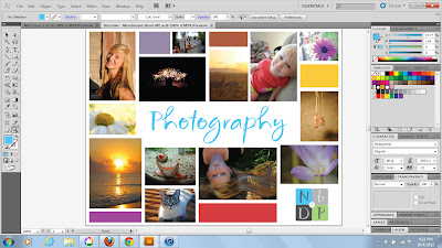
I started out with the idea to use my pictures to describe me, and what I like to do. I also thought maybe I should label them! As shown in picture below.....
Then, since i wasn't able to fit every picture I wanted to on there with the labels, I decided to take the labels and borders off.....
That worked a lot better, I think looked more like a moodboard, and was not so cluttered. But, if you noticed, there were lots of awkward shapes that weren't filled. That posed a problem, because it looked incomplete. So, I came up with the idea of filling those shapes in with squares and rectangles of color. I matched the color to my logo for my photography that I included in my moodboard.
When we did critiques in class though, my teacher suggested that I take color samples from the pictures on the moodboard instead. I tried it, and to my surprise it worked a lot better, and looked warmer, and not so uniform.
I noticed that the purple square on the top left was on the same side as the purple rectangle on the bottom left. I wasn't too thrilled with how it looked, so I switched the colors of the top middle rectangle with the purple square on the top left. That worked a lot better in my opinion.
Now, since my teacher had suggested I include photographs that I like, and not just my photography, I created a template from the above moodboard. That way, I can make 2, one of inspiration and one of my photography. I did like the idea of representing me and who I am through my work, but he wants something a little different, so... I'll just make 2!)


No comments:
Post a Comment