I have not had enough time to even think of researching a topic to post about, so here's whats been taking up all my time :)
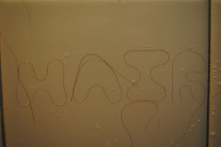
I have been working on a project for school, more specifically my Intro to Communication and Design class. In this project we had to make words out of 3D objects like these:
I went with my Caution Tape idea:
Then once we chose the idea we liked best we had to start making a 2D version in Photoshop and or Illustrator. Which I have almost gotten half way though!
This project has been taking up my time... THOUGH I did research Stefan Sagmeister :) So here's some information I had found for the project I did:
Born in Bregenz, a quiet town in the Austrian Alps, in 1962, Sagmeister
studied engineering after high school, but switched to graphic design
after working on illustrations and lay-outs for Alphorn, a left-wing
magazine.
At 19, Sagmeister moved to Vienna hoping to study graphics at the city’s
prestigious University of Applied Arts. After his first application was
rejected he enrolled in a private art school and was accepted on his
second attempt. Through his sister’s boyfriend, the rock musician,
Alexander Goebel, Sagmeister was introduced to the Schauspielhaus
theatre group and designed posters for them as part of the Gruppe Gut
collective. Many of the posters parodied traditionally twee theatrical
imagery and offset it with roughly printed text in the grungey typefaces
of punk albums and 1970s anarchist graphics.
In 1987, Sagmeister won a Fulbright scholarship to study at the Pratt
Institute in Brooklyn, New York. Here humour emerged as the dominant
theme in his work. When a girlfriend asked him to design business cards
which would cost no more than $1 each, Sagmeister printed them on dollar
bills.
After three years in the US, Sagmeister returned to Austria for
compulsory military service. As a conscientious objector, he was allowed
to do community work in a refugee centre outside Vienna. He stayed in
Austria working as a graphic designer before moving to Hong Kong in 1991
to join the advertising agency, Leo Burnett. When the agency was
invited to design a poster for the 1992 4As advertising awards ceremony,
Sagmeister depicted a traditional Cantonese image featuring four bare
male bottoms. Some ad agencies boycotted the awards in protest and the
Hong Kong newspapers received numerous letters of complaint. By spring
1993, he had tired of Hong Kong. Sagmeister spent a couple of months
working from a Sri Lankan beach hut before going back to New York.
As a Pratt Institute student, his dream had been to work at M&Co,
the late Tibor Kalman’s graphics studio. Sagmeister bombarded Kalman
with calls and finally persuaded him to sponsor his green card
application. Four years later on his return from Hong Kong, the green
card came through. His first project for M&Co was an invitation for a
Gay and Lesbian Taskforce Gala for which he designed a prettily
packaged box of fresh fruit. A few months later, Tibor Kalman announced
that he was closing the studio to move to Rome, and Sagmeister set up on
his own.
His goal was to design music graphics, but only for music he liked. To
have the freedom to do so, Sagmeister decided to follow Kalman’s advice
by keeping his company small with a team of three: himself, a designer
(since 1996, the Icelander, Hjalti Karlsson) and an intern. Sagmeister
Inc’s first project was its own business card, which came in an acrylic
slipcase. The second commission came from Sagmeister’s brother, Martin
who was opening Blue, a chain of jeans stores in Austria. Sagmeister
devised an identity consisting of the word blue in black type on an
orange background.
As none of the record labels he approached seemed interested in his
work, Sagmeister seized the chance to design a CD cover for a friend’s
album, H.P. Zinker’s Mountains of Madness. of Madness won Sagmeister the
first of his four Grammy nominations.
Invited by Lou Reed to design his 1996 album Set the Twilight Reeling,
Sagmeister inserted an indigo portrait of Reed in an indigo-tinted
plastic CD case. The following year, Sagmeister depicted David Byrne as a
plastic GI Joe-style doll on the cover of Feelings. One of his
trickiest assignments was for the Rollings Stones’ 1997 Bridges to
Babylon album and tour. Sagmeister struggled to persuade the band’s
management to accept his motif of a lion inspired by an Assyrian
sculpture in the British Museum. Also the astrological sign of the
Rolling Stones’ lead singer, Mick Jagger (a Leo), the lion doubled as an
easily reproducible motif for tour merchandise.
As well as these music projects, Sagmeister still took on other
commercial commissions and pro bono cultural projects, such as his AIGA
lecture posters. When Stefan Sagmeister was invited to design the poster
for an AIGA lecture he was giving on the campus at Cranbrook near
Detroit, he asked his assistant to carve the details on to his torso
with an X-acto knife and photographed the result. Sunning himself on a
beach the following summer, Sagmeister noticed traces of the poster text
rising in pink as his flesh tanned.
This information was found on http://designmuseum.org/design/stefan-sagmeister
WARNING: The last picture on this page has Stefan Sagmeister naked, though it cuts off at his LOW torso. :P Just a warning :)
 |
| This is a picture of him. |
Here is some of his work:
 |
| I apologize for the graphicish nature of this, but he got notoriety in the 1900's as the artist that self harmed in the name of craft. He had his assistant carve with an exact-o knife into his torso. |

.jpg)

.jpg)


